• re: untitled

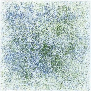
    I was also thinking that the shape is more obtrusive with the contrast to the background when the color is darker. I also loved your series, "Interactions." I wonder what your intention is with that title. I think of interactions between the viewer and the piece, between the colors, between the dots, between the shapes and the background, and even between the viewer and the artist. You mentioned that you often don't title your works because it detracts from the viewer's perspective. What encouraged you to title the series?


    •  

      Hi, I am sorry for my late response. Yeah, shure I agree 🙂 Oh, thank you very much for your comment 🙂 It is very nice to hear that 🙂


      Your understanding of »Interactions« is great, understanding of this title is meant to be left to the spectator, whatever comes to their mind. Well, for me, these prints are also connected to my Masters degree, and the title was »Interacion between color and drawing in art space«. I also compared the same plate in different colors, and their interaction. Every color has its own phisical and psycological influences on us, also the shape of the form... I hope that I answered you 🙂