re: untitled
Uji, thank you very much for your kind comment 🙂 I really love the combination of drawing and color. And sometimes is such a small line between drawing and "painting". I love to explore these borders 🙂
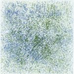
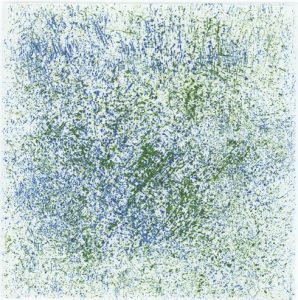
My master was about the color and drawing, so I was comparing the same plate (prints) in different color. First I printed primary colors, and then I added white color, and when I was comparing them (alltogether), they were different, (of course they were different because, the color was not the same, but the plate was), so during my researce and study I figured out, that when the color is strong, also the shape of the form (for exsample if we are looking one dot) is of course clearly seen, because the color is strong, and when I brighten the color, the shape of the form looses strenght, especially if the paper is white. Of course I also have to think about that 🙂 And because the form is not so clearly seen, we are "looking" what colour was used and than the shape.
I hope that I aswered your question. If you have any futher questions feel free to ask me. 🙂
Best 🙂